Principles of Visual Figure Correction
Let's explore the core principles of visual figure correction and the tools used to create a harmonious silhouette. We'll look at how proportions, garment length, lines, shape, and volume affect the way a figure is perceived, as well as how to redistribute visual emphasis and build a more balanced silhouette.
Understanding visual correction techniques allows you to consciously shape a silhouette and build a balanced look that works with the specific characteristics of a figure.
Correction is built around a set of key tools: the direction of lines, garment length, distribution of volume, placement of emphasis, and the use of colour, texture, and print. A stylist's goal is to use these visual techniques to highlight the strengths of a figure and bring the silhouette into harmony.
It's worth bearing in mind that deliberately breaking the principles of a harmonious silhouette can itself be an intentional stylistic choice.
Working with Proportions, Lines, and Volume
Proportions refer to the relationship between the length and volume of different parts of the body relative to one another. They form the very first visual impression of a look.
Let's look at the classical understanding of visually harmonious proportions.
Styling practice frequently draws on the principle of dividing the silhouette in a 1:2 ratio. This means one part of the figure — the legs, for example — occupies roughly two thirds of the total silhouette length, while the other part — the torso — takes up one third. This division tends to feel more visually stable than an equal 1:1 split.
It's worth keeping in mind that an equal upper-to-lower ratio can create a sense of stillness and visually shorten the figure.
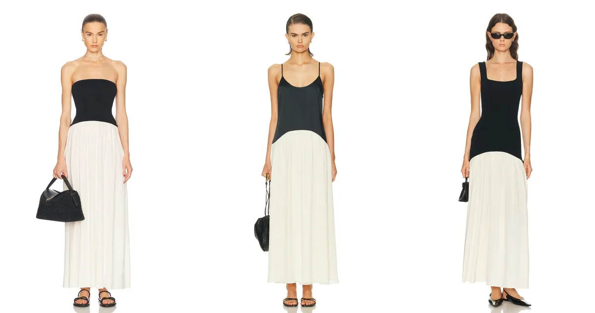
▶ On the left, the figure looks more harmonious thanks to a silhouette division close to a 1:2 ratio. This proportional split visually lengthens the legs.
▶ In the second example, the waistline sits lower, so the leg-lengthening effect is less pronounced.
▶ In the third example, the silhouette division approaches a 1:1 ratio. As a result, the upper body reads as longer, and the legs appear shorter.
Correcting the Figure with Lines, Volume, and Shape
Lines play a key role in shaping the silhouette and have a direct impact on how proportions are perceived.
Every line in a garment is a tool for directing attention. Shoulder lines, waistlines, seams, darts, asymmetry, sleeve cut, and garment length all create a new visual outline over the body.
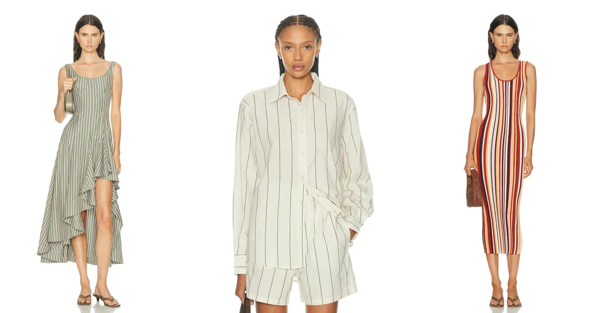
Vertical lines visually elongate the figure, making it appear narrower and taller. Elements that achieve this include vertical stripes, zips, contrast topstitching, trouser creases, long chains, and longline jackets. It's important to consider the spacing between verticals, however — if the gaps are too wide, the effect is weakened.
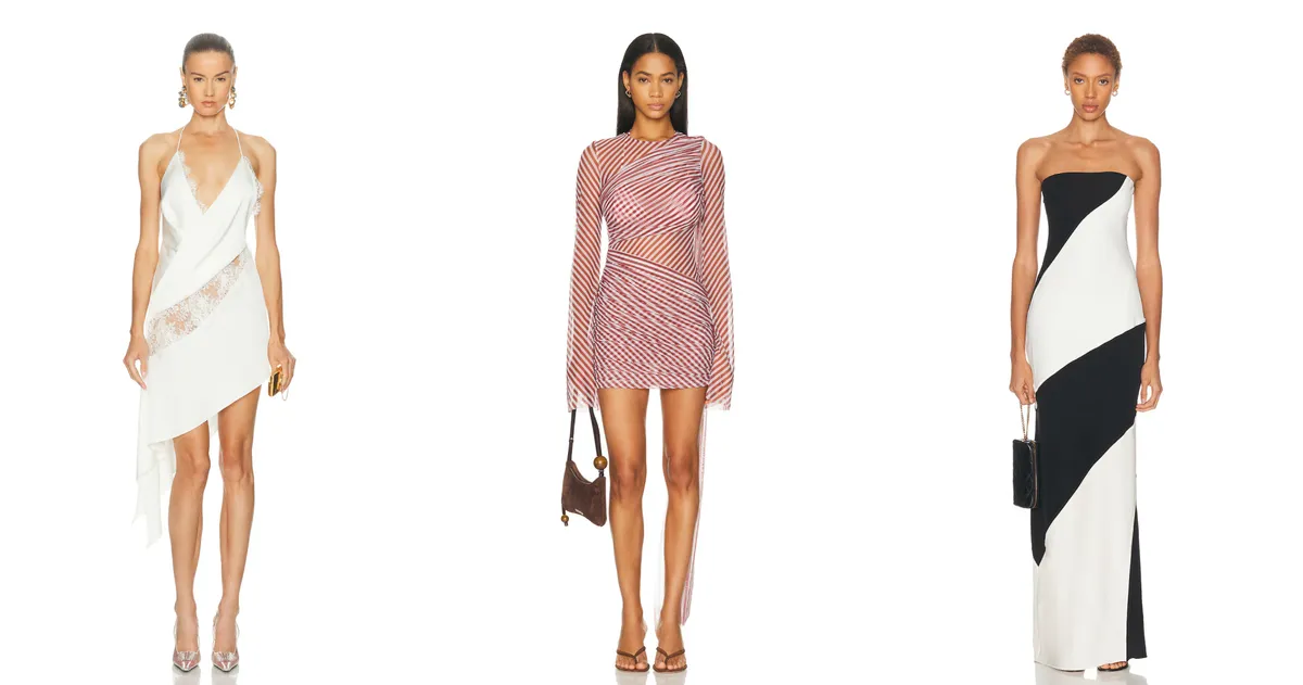
Diagonal lines create movement and guide the eye. Depending on their direction and angle, they can either soften a shape or add volume to it. A diagonal always introduces dynamism and counteracts a static silhouette.
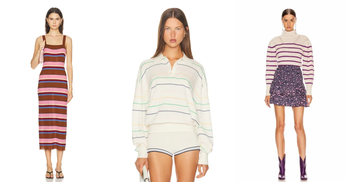
Horizontal lines broaden the shape and visually reduce the length of the silhouette.
These can take the form of seams, cut lines, contrast belts, or colour-blocked horizontal divisions.
For example, a dress with a strong horizontal waistline visually divides the figure and can reduce the sense of height. A raised waistline makes the silhouette appear more elongated — the legs look longer and the upper torso shorter — while a dropped waistline has the opposite effect, shortening the overall figure.
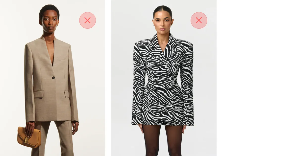
▶ It's best to avoid having the sleeve hem align with the garment hem: repeating horizontal lines can create a sense of heaviness and throw the balance off, making the overall look feel disjointed.
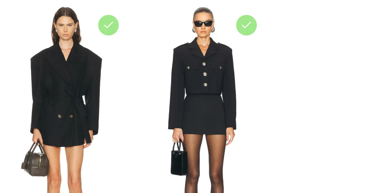
▶ Choose a sleeve length that sits either above or below the garment hem. This avoids the repetition of horizontal lines and makes the overall look more harmonious.
Garment Length
Garment length creates a horizontal line that directly affects how the figure's proportions are perceived. The hemline divides the silhouette and draws attention to a specific area. Depending on where that horizontal falls, it can visually lengthen the legs, shift the waistline, alter proportions, and redistribute the emphasis within a look.
For instance, it's generally best not to end a sleeve at the widest part of the arm, unless the intention is to add volume there.
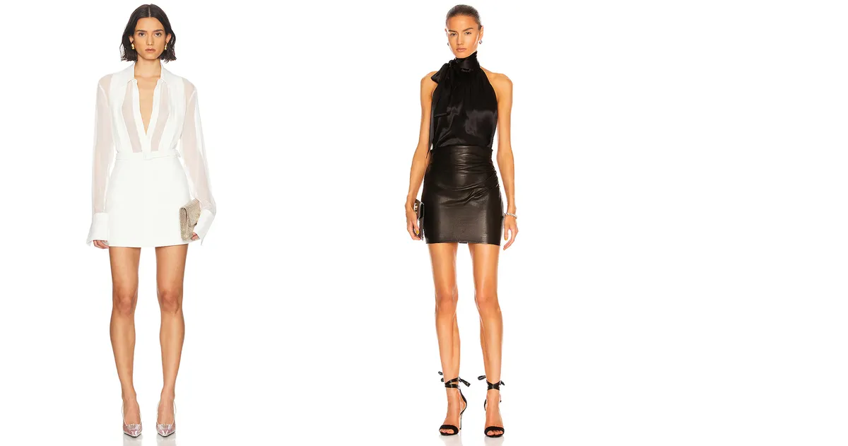
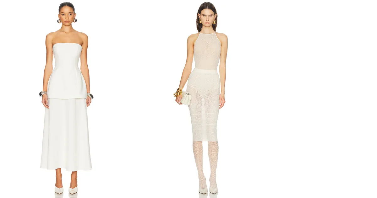
Midi-length garments fall anywhere from the knee to the ankle. If the hemline passes through the widest part of the leg — the middle of the calf, for example — the volume of that area is visually emphasised.
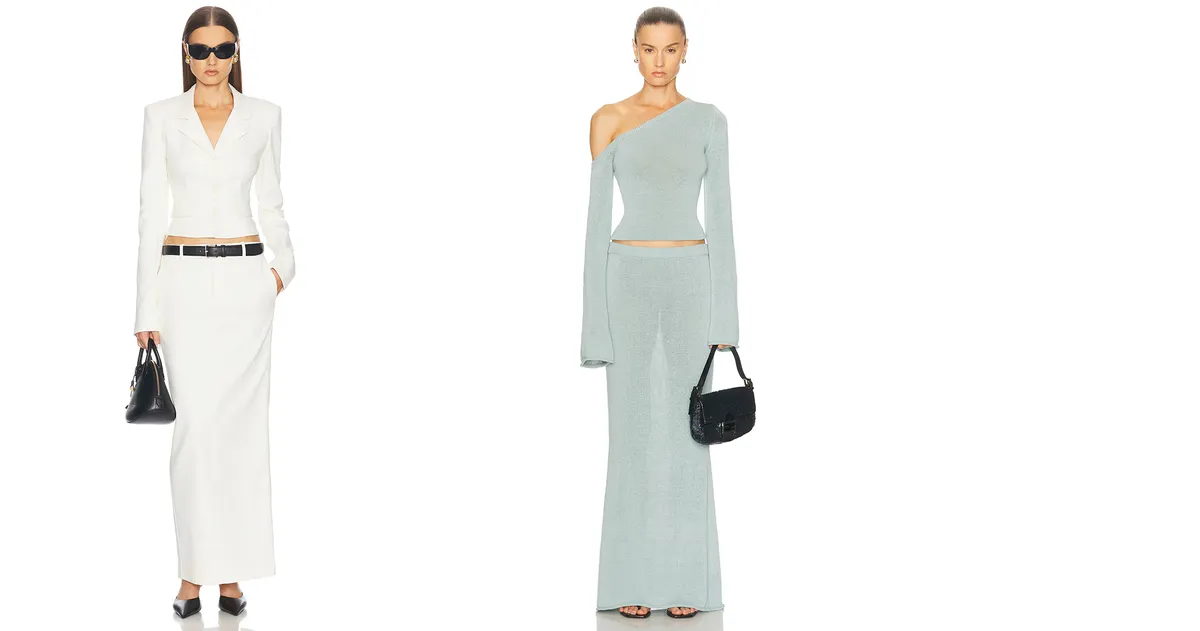
Maxi length creates a continuous vertical line that can either elongate the silhouette or weigh it down, depending on the cut, fit, and distribution of volume.
Where there is pronounced volume around the hips and waist, styles with a clear vertical structure or a high waistline — such as an empire silhouette — tend to be the most flattering.
For petite figures, maxi length calls for particular attention to proportions and footwear, as excess volume in the lower half can visually shorten the silhouette.
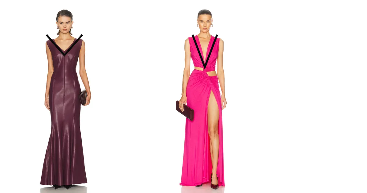
The apex of an angle creates a visual narrowing, while its diverging sides produce a sense of volume.
▶ The wider the angle, the stronger the widening effect — and conversely, the narrower the angle, the weaker it becomes.
▶ The proportions of the angle also matter. A tall, narrow angle approaches a vertical form. In that case it adds less width to the area and does more to visually elongate the silhouette.
Volume creates visual weight within the silhouette. When volume is concentrated in one area, the balance shifts towards that point. By redistributing volume — adding it to the upper silhouette or reducing it in the lower half — you can even out proportions and create a more harmonious composition.
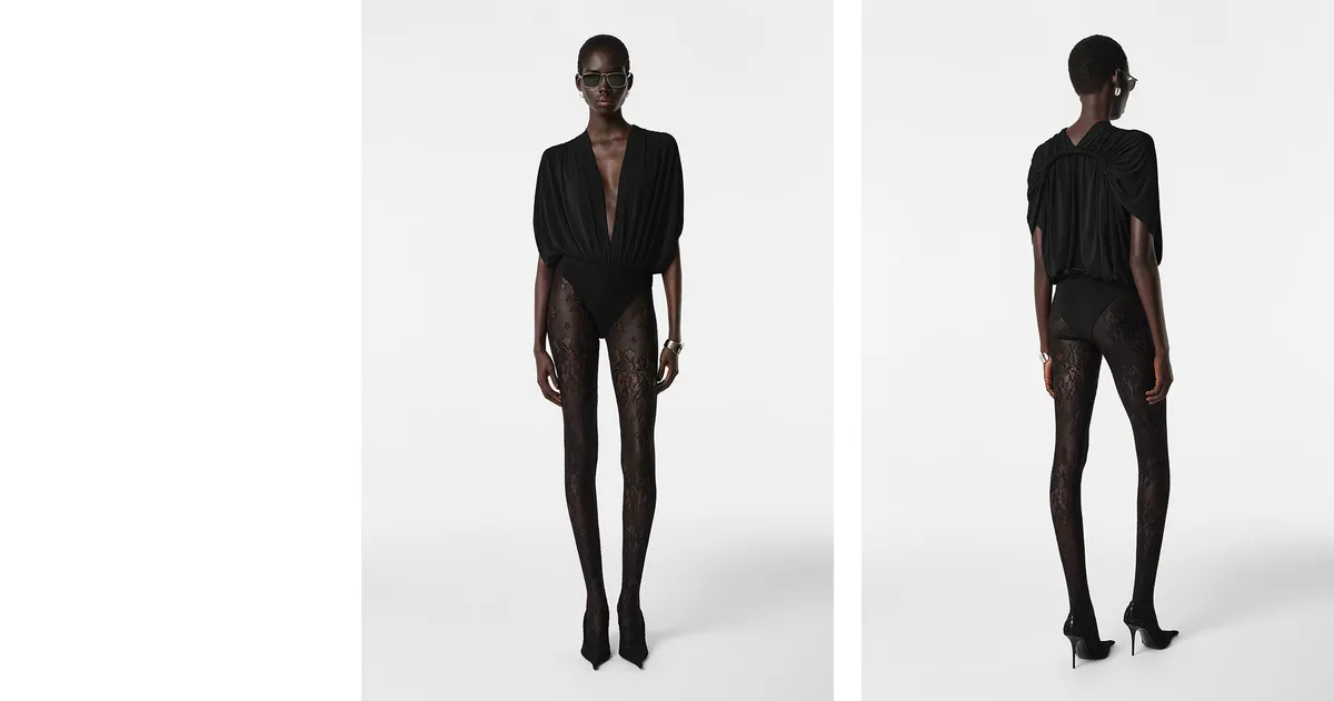
In this example, volume is concentrated above the waistline. Pointed-toe heels combined with a head-to-toe black look create a strong vertical line, making the silhouette read as more elongated and slender in the lower half. Meanwhile, the lines that splay outwards towards the top further enhance the visual broadening of the upper silhouette.
It's important to remember that volume is created not only by cut, but also by the properties of the fabric. Even a fine material can visually enlarge an area when heavily draped, while a dense, structured fabric produces a more contained and defined outline. The overall effect depends on the combination of texture, weight, and construction.
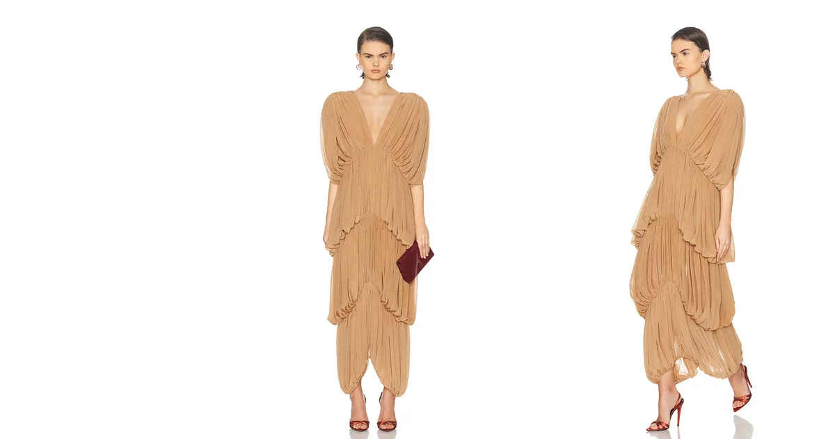
In this example, the many folds of a lightweight fabric form wide angles that fan out downwards. This creates a voluminous silhouette along its full length and makes the figure appear broader overall.
When working with volume, it's essential to consider the scale of garment elements in relation to the figure. Contrast in scale intensifies the perception of form: something large placed next to something small appears even larger, while something small against a large backdrop looks even smaller.
For example, an overly narrow belt on a pear-shaped figure — where the hips are the dominant feature — can actually accentuate the volume of the lower half. Small back pockets have a similar effect: against such a modest element, the surrounding volume reads as even more pronounced.
If the goal is to visually streamline the figure, it's worth avoiding excessively small decorative details such as tiny buttons, fine prints, or delicate accessories. Rather than minimising the figure, they can amplify the sense of scale and make it feel heavier.
For petite figures, oversized prints or very large accessories can create an imbalance and visually reduce height. In these cases, wardrobe elements should be proportionate to the scale of the figure.
Scale contrast works in the other direction too. To draw attention to delicate wrists, for instance, a more voluminous sleeve can create an effective visual contrast. At the same time, a deep V-neckline on someone with a particularly slender neck can accentuate that fragility even further.
Closed and Open Outlines
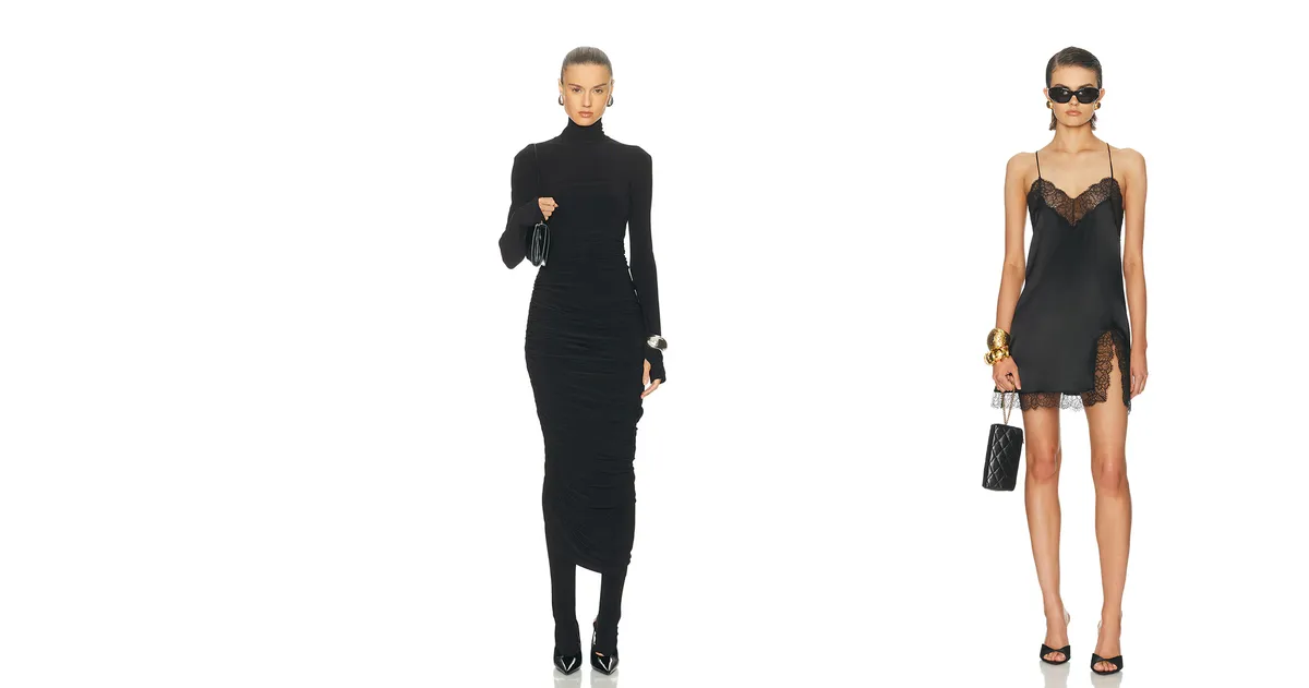
How volumious the figure appears depends greatly on whether the silhouette reads as closed or open.
▶ A closed outline creates a contained silhouette. This approach makes the figure look more compact and pulled together. Examples include long sleeves, high necklines, and the absence of exposed skin.
▶ An open outline, by contrast, is created by deep necklines, thin straps, and exposed arms, shoulders, or legs. The uncovered areas of the figure read as more voluminous and draw greater attention.
For example:
▶ A polo neck or roll-neck creates a closed outline at the top of the silhouette. As a result, the neck can appear shorter and the overall height lower.
▶ A vest or top with an open neckline and exposed shoulders creates an open outline, giving the upper silhouette a more airy, elongated appearance.
▶ For broad shoulders, a closed neckline can actually help balance the look — it draws the upper body in and visually reduces the width of the shoulders.
Redirecting the Focal Point
The focal point is the area of a look that the eye is drawn to first.
It can be created by colour, texture, print, a design detail, an accessory, or any number of other elements.
By shifting the focal point to a specific part of the silhouette, we direct attention and adjust the perception of proportions.
The idea is to guide the eye towards the most flattering area. Visual attention always settles on the most expressive detail, which is why that detail becomes the compositional centre of the look.
For example, if the lower silhouette appears more voluminous, the focal point can be moved upwards using jewellery, a contrasting colour, an expressive shoulder line, or an interesting texture. The eye then settles on that chosen point, and the fuller area loses its status as the centre of attention.
The focal point can be shifted using bold or contrasting elements such as:
▶ statement jewellery;
▶ accessories (a scarf, glasses, a bag);
▶ accent cuts or embellishments;
▶ colour or texture;
▶ make-up.
The Principle of Shape Similarity
There is a consistent pattern in visual perception: like amplifies like.
When the shape of a garment mirrors the shape of facial features or body lines, those characteristics become more pronounced.
For example:
▶ A square neckline on someone with a prominent square jaw accentuates the angularity of their features.
▶ A round neckline on a round face emphasises its softness and gentle curves.
▶ A narrow neckline reinforces the sense of an elongated, slender face shape.
In short, repeating a geometric form amplifies its character. If someone has rounded features, rounded lines in their clothing will make those features even more noticeable. If the features are angular, sharp geometric lines will accentuate that structure further.
This principle extends beyond necklines to seam lines, print shapes, decorative details, and accessories.
In practice, a stylist can use this effect either to enhance distinctive features or to soften them. When the aim is correction, the key is not to mirror the shape but to create a counterpoint to it.
Read next
Body Shape Analysis
Visual Correction Through Colour
We explore how colour affects the visual perception of the figure, its impact on volume and proporti…
Body Shape Analysis
Body Shape Basics
Let's explore the main body shape types, their proportions, and how to choose clothes that work best…
Palette
Черный цвет в одежде
Рассмотрим восприятие черного цвета в одежде и его влияние на внешность.