
Map of Harmonious Shades
Let's explore one of the key tools in colour-type analysis — the map of harmonious colours.
The map of harmonious shades is a visual representation of colour space, displaying all possible shades distributed according to hue, saturation, and brightness.
The map of harmonious colours can also be broadly divided into four zones: light, muted, deep, and clear.
The light zone contains colours with high brightness and low saturation.
The deep zone contains colours with low brightness and high saturation. In terms of its characteristics, it is the opposite of the light zone.
The muted zone comprises colours with low saturation and reduced brightness.
The clear zone comprises colours with high saturation and brightness. It is called "clear" because the colours within it contain no achromatic admixture — they read as maximally saturated and vivid.
Within this map sits a unique tool: the harmonious shade range — a span of shades belonging to a single hue within which colour harmony with one's appearance is maintained. The tool reflects the permissible level of contrast in brightness and saturation for a given colour, and analyses these parameters to define this range mathematically on the map.
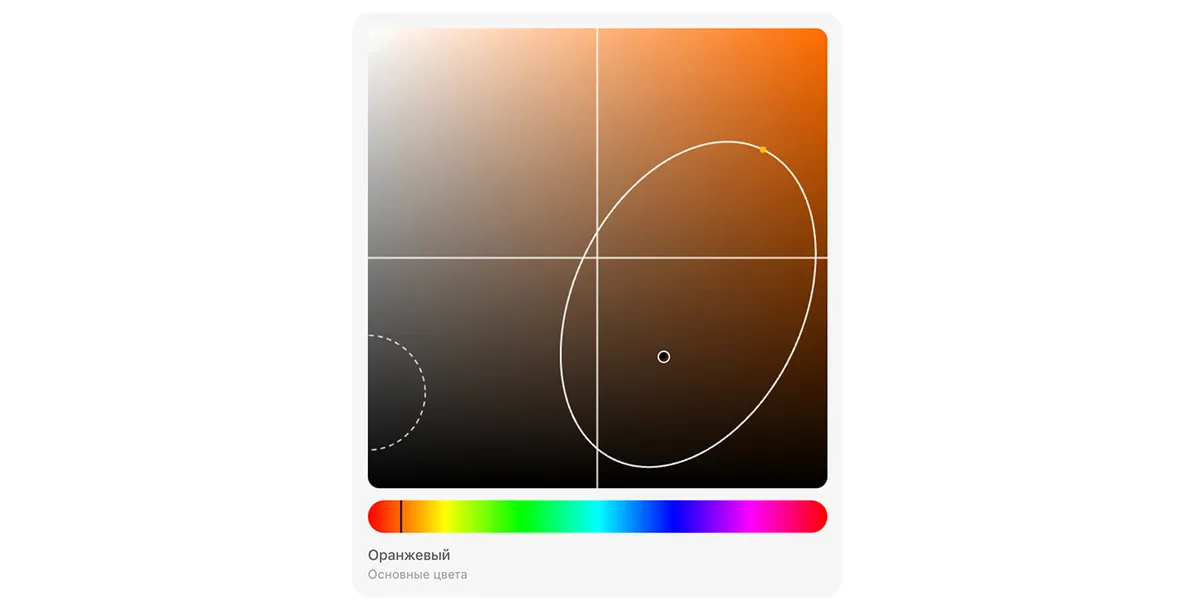
The harmonious shade range makes it possible to:
▶ find flattering shades more quickly;
▶ avoid random, hit-or-miss choices;
▶ work with colour as a system rather than relying purely on intuition.
Colours that fall outside the harmonious shade range are considered unsuitable. They can distort how your appearance reads and undermine colour harmony.
Such colours tend to:
▶ create excessive contrast;
▶ draw attention to themselves rather than to you;
▶ disrupt the overall coherence of a look.
That is precisely why, when building a palette, it is just as important to consciously rule out unsuitable colours as it is to select the right ones.
To learn more about the role the harmonious shade range plays in colour-type analysis, follow the link below.
Read next
Color Type Analysis
Understanding Your Dominant Tone
Let's explore what a dominant tone is and the role it plays in building a harmonious colour palette.
Color Type Analysis
The Role of the Harmonious Shade Zone in Colour-Type Analysis
Let's explore the role that the harmonious shade zone plays in building a cohesive colour palette fo…
Color Type Analysis
How to Use the Digital Colour-Type Analysis
A step-by-step guide: from uploading your photo to receiving your personal palette.