
Angelina Jolie's Colour Type
Using Angelina Jolie as our example, we explore which shades bring out her natural beauty — and which ones work against it. Why does she look utterly stunning in some outfits, yet tired and washed-out in others?
The results of Angelina Jolie's colour-type analysis show that her colouring belongs to a muted color type, with yellow-orange as her dominant hue.
Her hair is dark and fairly high in saturation, with an orange hue.
Her eyes have relatively high brightness but low saturation, with a yellow-orange hue.
Her skin has a fairly well-saturated undertone with a red-orange hue.
The centrepiece of the analysis is a colour-harmony map, which clearly illustrates the range of shades that work most harmoniously with Angelina Jolie's appearance. You can explore this yourself by uploading a photo of Jolie into the Colour-Type Analysis tool. It will show you exactly which colours and shades fall within her harmonious range — and which ones are best avoided.
On the colour-harmony map, you can see how the shades shift within the zone that suits Jolie's colouring. Moving freely through that zone reveals a wealth of shades that complement her look beautifully. You can also adjust the hue across the full color wheel to see how different colours behave within her palette.
Let's now look at some real outfits and see exactly how shades within Jolie's harmonious zone — and those outside it — affect the way her appearance is perceived.
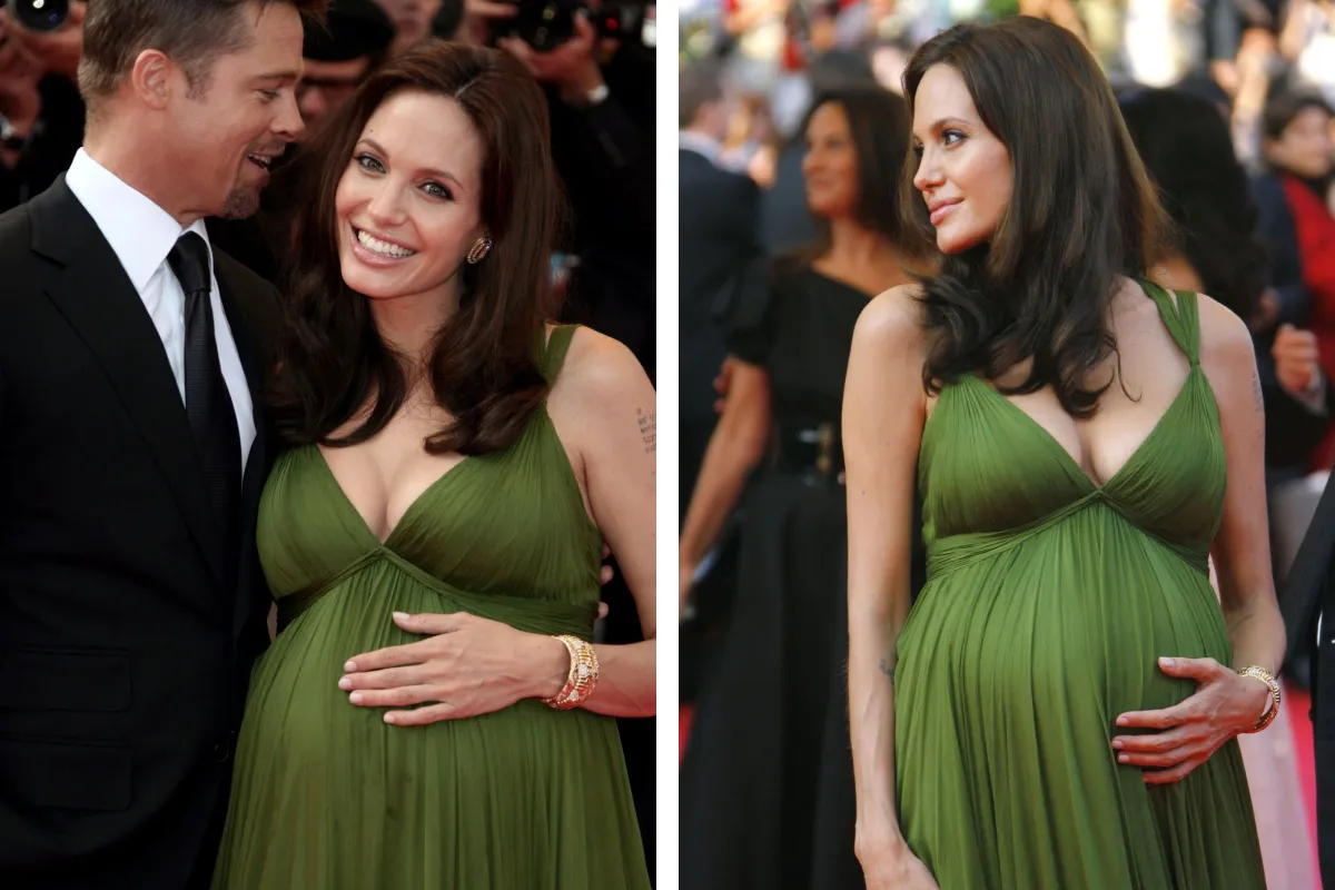
The shade of this dress falls into the yellow-green range, making it an analogous colour for Jolie. As a reminder, every person's colouring has a dominant hue, and colours that sit adjacent to it on the color wheel are considered analogous — they create a soft, gentle contrast. For Jolie, yellow-green is one of those analogous colours. This particular dress shade also falls within her harmonious zone. Notice how naturally it complements her appearance, giving the overall look a calm, effortless quality.
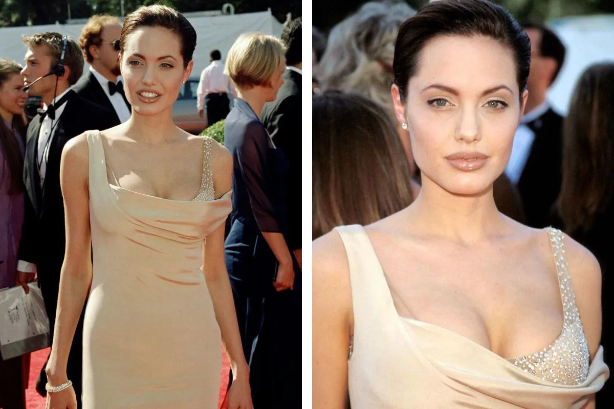
Now take a look at this pastel orange shade. Although it is also analogous to Jolie's dominant hue, it falls outside her harmonious zone. Whereas the yellow-green shade we saw earlier created a balanced contrast with her colouring, this one disrupts the colour harmony and introduces discord. It also sits too close to her skin tone, which visually diminishes her features and leaves her looking washed-out.
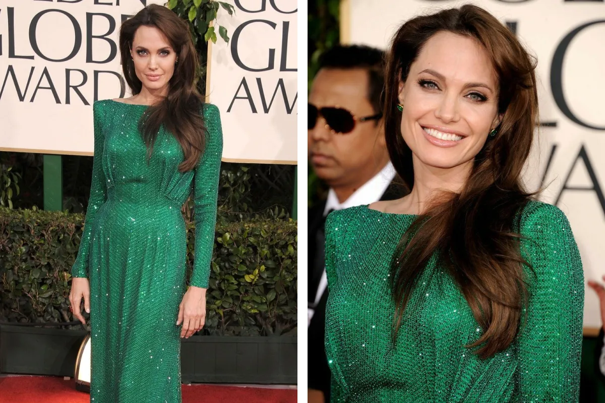
Here's a great example: notice how this cool green shade works with Jolie's colouring. Despite being a high-contrast colour for her, it sits within her harmonious zone and therefore pairs beautifully with her appearance. It sharpens her facial features and gives her look a fresher, more striking quality. Generally speaking, moderately saturated, lighter shades of this character suit Jolie particularly well.
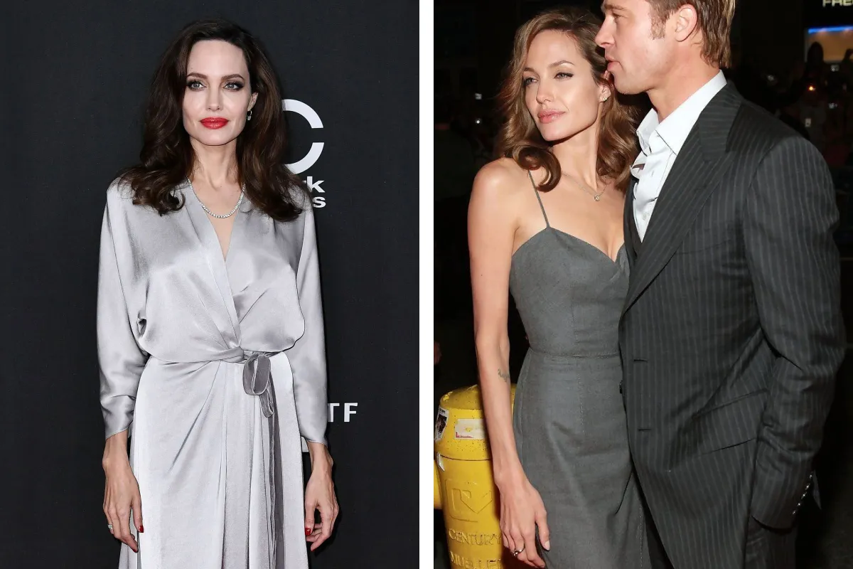
It's worth looking separately at Angelina Jolie's achromatic palette. In the image on the left, a grey that is too light makes her look pale and tired. Her dark hair reads as heavy and severe, and the high-contrast make-up amplifies this effect even further. Of course, any look is always perceived as a whole — clothing colour, hair, make-up, and accessories all play their part.
In the image on the right, the grey has been chosen in keeping with her achromatic palette, so it maintains colour harmony and softly enhances her features. A gentler hair shade and well-balanced make-up reinforce the effect further.
It's important to note that achromatic shades can work for anyone — the key is choosing the right brightness. For this reason, alongside the standard harmonious zone, every person's colouring also has a harmonious achromatic range. Both zones are determined not subjectively, but through mathematical algorithms. This is what sets the Seelekta method apart from traditional approaches. At the heart of the system is a spatial colour-harmony model — a mathematical framework that describes the relationship between the colour parameters of a person's appearance and the space of possible shades. The harmonious zone is the geometric representation of that model. It is precisely this model that makes it possible to calculate a person's individual space of harmonious shades and generate a rich set of colour solutions that are in tune with any appearance.
Read next
Palette
Черный цвет в одежде
Рассмотрим восприятие черного цвета в одежде и его влияние на внешность.
Palette
White in your wardrobe
White is one of the most versatile colours in fashion and works beautifully with any complexion. Let…
Modern Colour Basics
How Achromatic Colours Are Perceived in Clothing
How achromatic colours in clothing affect the overall impression of an outfit and the associations t…