
Core Characteristics of Colour
Every colour has defining qualities that shape how we perceive it visually and emotionally.
Depending on how these properties combine, a colour can feel soft or bold, calm or intense, light or visually heavy. It is precisely this combination of qualities that forms our overall perception of a colour and determines how expressive it appears.
Hue
Hue — a colour's position in the spectrum. Simply put, it is the colour itself: red, blue, green, yellow, and so on.
Saturation
Saturation — the intensity of a colour. The higher the saturation, the more vivid and rich the colour appears. As saturation decreases, the colour shifts towards grey or white.
Brightness
Brightness (also known as Value) — how light or dark a colour is. Adjusting brightness makes a colour either lighter or darker.
Shade
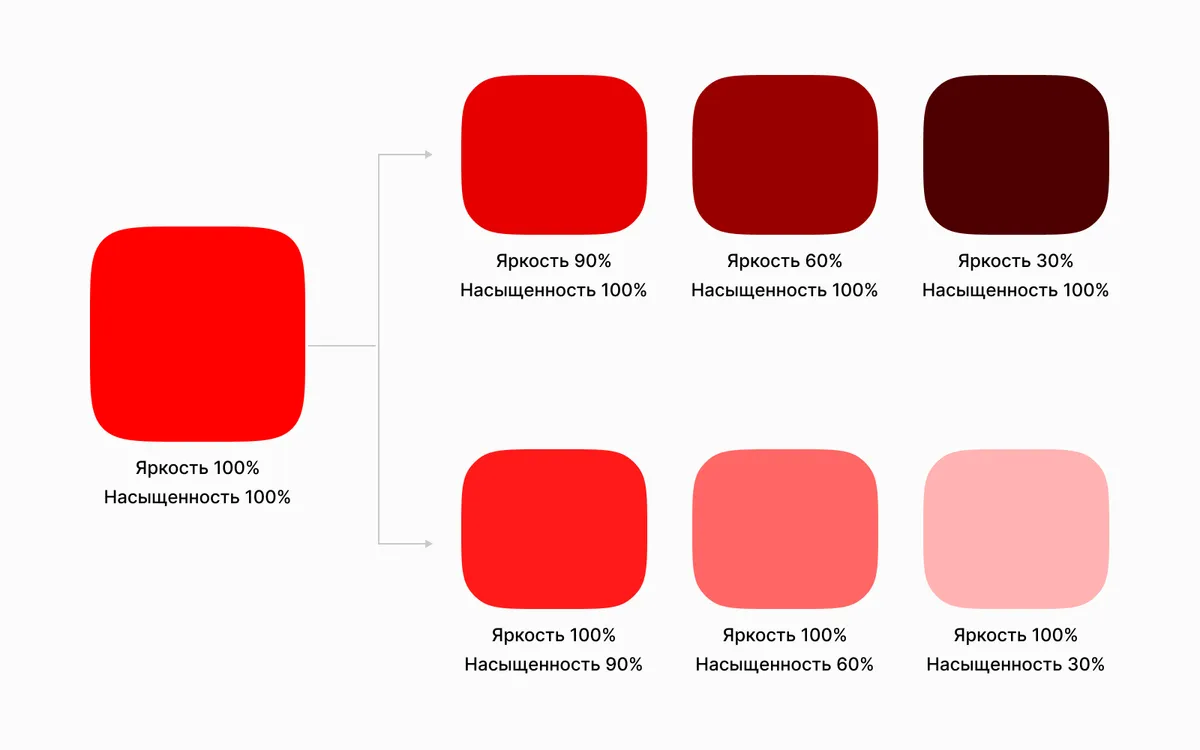
A shade is a variation of the same hue, modified in brightness or saturation. Red, for instance, can appear as scarlet, pink, or burgundy — all shades of the same colour, distinguished by differences in brightness and saturation.
Spectral Colours
Pure (spectral) colours are the fullest expression of a given hue — they have high brightness and saturation and contain no achromatic mixture. Once brightness or saturation is altered, the colour moves into the category of shades of that hue.
For example, here is how these characteristics can manifest in red:
Try it yourself
Find your colour type from a photo
Seelekta determines your colour type from a photo and builds a personal palette of harmonious colours and shades that suit your looks.
Find my colour type